BSBKJVWEBYLTASVBBEWMBT4TDBY|HymnsMusicDonate
Menu
Announcements

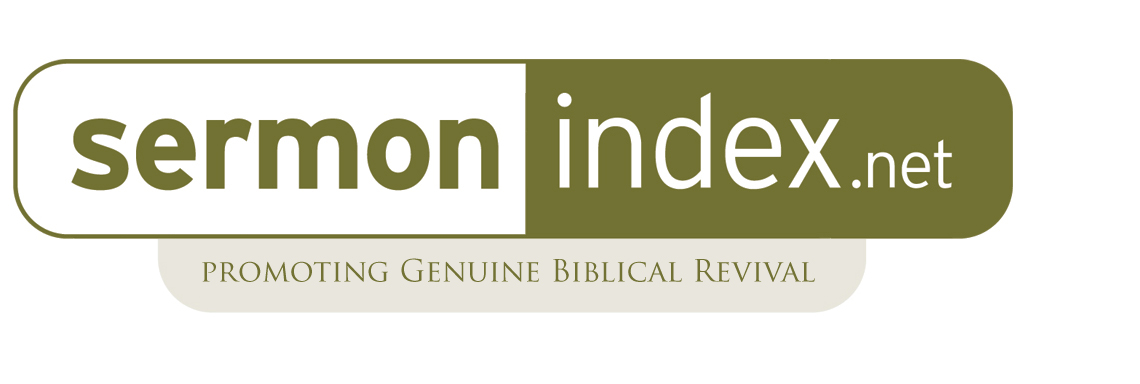
New Header Logo for SermonIndex, thoughts?

sermonindex Feb 22, 2011

Saints,

I wanted to get to know what everyone thinks of the re-designed sermonindex logo. I feel this is an important step after 9 years to have a higher resolution logo that is clear and well done.

Thanks to Jake Stuzman for helping with the re-design: http://twitter.com/jstutzman he does great work at his design company here: http://www.elevatevc.com/


Here is the new logo header:
https://www.sermonindex.net/images/misc1/header2.gif

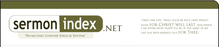
Here is the old logo header:
https://www.sermonindex.net/images/misc1/oldheader.gif
sermonindex Feb 22, 2011

I am open to the thoughts of the brothers and sisters on here. This is not a permnant change yet and am considering the new logo, etc.

Please share your feedback.

L
Lysa Feb 22, 2011

I like the new one but it lacks the black color of "sermon" and ".net" that's on the old one that POPS out at you!!

C
Christisking Feb 22, 2011

Looks good Greg!

H
HeartSong Feb 22, 2011


Graphically the new one is better, but I like the old one. Prettier is not always better.

If you do use the new one, the "Promoting Genuine Biblical Revival" needs work. It feels off balance - mushy - maybe because of the amount of radius at the bottom of the box outlining it in relation to the smaller font size. Also the placement of the small box on the larger box seems awkward and there is not enough dead space to the left of the "s" in the word sermon, it feels squished in relation to the space around the rest of the word "sermonindex."

I hope you really did want my opinion :|

Sometime people ask my opinion, and if they ask, I give it, but then I find out that they really did not want it - even though it is only my opinion.

How much do these things really matter anyway? One thing about making something "nicer" is that any flaws become more obvious - it must be part of the refining process.

C
ccchhhrrriiisss Feb 22, 2011

This is okay. Personally, I like the older version.

https://www.sermonindex.net/images/misc1/header2.gif.pagespeed.ce.5TIqIlwCPr.gif

I think that the new design looks a bit unbalanced with the ".net" added inside and the "Promoting Genuine Biblical Revival" off center. It also makes it seem like the ministry's name is "SermonIndex.net" rather than "SermonIndex" (whereas the ".net" was outside of the logo in the older design).

Either way, the Lord bless you for your efforts, Brother Greg!

*EDIT: My wife agrees. She likes the "Promoting Genuine Biblical Revival" under the new one (if it were centered) and the actual logo of the previous.

** Now, we are off to the dentist. Please keep my wife in your prayers!

K
KingJimmy Feb 22, 2011

Though not radically different, I do like the older one better. Maybe you need something other than this pill like shape for a logo?

sermonindex Feb 22, 2011

Graphically the new one is better, but I like the old one. Prettier is not always better.

If you do use the new one, the "Promoting Genuine Biblical Revival" needs work. It feels off balance - mushy - maybe because of the amount of radius at the bottom of the box outlining it in relation to the smaller font size. Also the placement of the small box on the larger box seems awkward and there is not enough dead space to the left of the "s" in the word sermon, it feels squished in relation to the space around the rest of the word "sermonindex."

I hope you really did want my opinion :|

Sometime people ask my opinion, and if they ask, I give it, but then I find out that they really did not want it - even though it is only my opinion.

How much do these things really matter anyway? One thing about making something "nicer" is that any flaws become more obvious - it must be part of the refining process.

Thank you for all the valuable feedback and ideas. This is helping. I want to try and work with the new logo for abit and finish a page re-design with the front images also and then let it site for a few days. It is so hard to change once you have done something the same way for a long time.

I believe this new logo has potential and a cleaner look but of course flaws and not perfect. thanks for the continued suggestions.

C
Compton Feb 22, 2011

I like the new one. It's a good decision to have the ".net" locked up with the name. The majority of websites are .coms, so in this case having the net locked up to the name serves a very pragmnatic function.

The other option is to remove the .net altogether, because .com does work as well.

One small point. "Sermon" might need to be slightly enlarged...optically it is receding in prominence to "index."

But I really like the new look. It's a good idea things every few years.

By the way, have you seen Audio Sermon Index?

http://audiosermonindex.com/members/html/

That brand looks similar to this one, not only in name, but also in colors. (This site has a nice clean interface, while the latter is much more cluttered.)

Mike

sermonindex Feb 22, 2011

That brand looks similar to this one, not only in name, but also in colors. (This site has a nice clean interface, while the latter is much more cluttered.)

Thanks brother for the feedback. I help make that site over 8 years ago and he was one of the guys that helped give the idea for the SermonIndex.net domain!

I do want to keep the SermonIndex.net so that people will mostly link to that domain and "not" the .com (though the .com and .org just forward to the .net). It would be good if the .net is the primary site everyone links to over the web thus the idea to make it very clear to people through the logo.

sermonindex Feb 22, 2011

If you do use the new one, the "Promoting Genuine Biblical Revival" needs work. It feels off balance - mushy - maybe because of the amount of radius at the bottom of the box outlining it in relation to the smaller font size. Also the placement of the small box on the larger box seems awkward and there is not enough dead space to the left of the "s" in the word sermon, it feels squished in relation to the space around the rest of the word "sermonindex."

I made some of these changes. How do you feel it looks now sister? and I also changed the text back to the older style?

here is the larger looking version of it right now: https://www.sermonindex.net/images/misc1/sermonindex3.jpg

H
HeartSong Feb 22, 2011

The part underneath is much better. The word "index" is perfectly positioned but something happened to ".net" - the way it was before was much better - now it looks unbalanced. The space to the left the the "s" is better, but maybe a little too much - if you slightly increased the text size of the word "sermon" only (just a tad), but kept it bottom and right justified (only let it increase left and up) it should be just right.

I love the new banner in the middle of the front page!


I prayed and asked the LORD how a Christian is supposed to give constructive criticism - thank you for the encouragement.

T
TimmyJoe Feb 23, 2011

It looks great!! I like the new look of the site, it has a good clean look. I don't see anything else that could be better!

C
Compton Feb 23, 2011

Down below when I said "It's a good idea things every few years", I meant to say "It's a good idea to freshen things up every few years." I left out a few words!

Mike

L
lylewise Feb 23, 2011

Like the old one. Its like a brand identity.

C
Compton Feb 23, 2011

Sermon Index is indeed a brand. And Greg has maintained remarkably consistent "standards and guidelines" for the identity of the brand over the years. I think it's perhaps a small part of why the site stands out from the other Christian media sites.

I like the fact that some of us don't like the change. It means that the name means something personal to us. That is brand equity! And kudos to Greg for testing the change ala crowdsourcing.

I personally feel it is okay if the logo part of the identity evolves a little every few years. In fact, change is a sign that the brand promise is still alive, and not a "liturgy". ;)

http://www.instantshift.com/2009/01/29/20-corporate-brand-logo-evolution/

Mike

A
Areadymind Feb 23, 2011

I like the way the pictures of the preachers look way better now than the older one, you can actually tell who they are at a glance now. The only thing I could suggest would be more preachers instead of the repeated pattern, other than that I like the new look!

sermonindex Feb 23, 2011

Sermon Index is indeed a brand. And Greg has maintained remarkably consistent "standards and guidelines" for the identity of the brand over the years. I think it's perhaps a small part of why the site stands out from the other Christian media sites.

I like the fact that some of us don't like the change. It means that the name means something personal to us. That is brand equity! And kudos to Greg for testing the change ala crowdsourcing.

I personally feel it is okay if the logo part of the identity evolves a little every few years. In fact, change is a sign that the brand promise is still alive, and not a "liturgy". ;)

http://www.instantshift.com/2009/01/29/20-corporate-brand-logo-evolution/


Dear brother,

Excellent thoughts and link and thank you for the encouragements.

A
A-Run Feb 23, 2011

I think its Ok.

May be not much of a difference to the original one, but nonetheless it has newness.

If it can be improved then its good, otherwise this can be maintained. As the days go by, we will get used to it and start liking it.

I think Change is something we need to get used to in our lives. Change is the only thing constant in our lives- day by day changing into His Likeness!

M
mguldner Feb 23, 2011

I am liking the new Logo its much easier to look at for some reason. :) Of course I am always one for change and this one seems to be definitely for the better imho.

This discussion is locked.

Archived
1 of 20 posts